Case Study
A FOCUSED EXCERPT
This page walks through one flow — Outreach — from the larger Workforce Management Platform project above. It is not the complete case study, and the flow itself is still evolving, not a finished, shipped feature.
Overview
Edge is a workforce staffing platform built by Workforce Brokers LLC — the same platform behind the management dashboard above. Outreach is the module recruiters use to contact candidates at scale: a customer submits a request such as “200 cooks for Nashville, TN — start March 2, 6 PM–12 AM, $25/hr,” and a coordinator has to find, message, and confirm two hundred qualified workers before a competing agency does.
Before this redesign, that entire job — creating a campaign, selecting candidates, drafting a compliant message, tracking replies — lived on a single dense admin table with no creation flow at all.
“200 cooks for Nashville, TN. Start: March 2, 6 PM – 12 AM. Rate: $25/hr.”
A TYPICAL INBOUND REQUEST ON EDGE
20–30
requests a recruiter handles per day, across multiple clients
200+
workers to contact for a single large request
2
entry points into outreach — from Recruiting, or from a request row
<5 min
target time from “new outreach” to messages sent
Outreach Highlights
•
Bulk, multi-channel outreach: SMS and email campaigns sent to hundreds of candidates at once, tracked from send to confirmed assignment.
•
AI-assisted drafting: Templates pre-filled with job details and merge fields, with YES / NO / STOP compliance language built in.
•
List, card and map selection: Three ways to choose candidates — including a map view, since on-site shift work makes distance disqualifying.
My Contribution
•
Audited the legacy Outreach table to separate proven operational logic (auto-replies, reminder cadences) from what was actually broken (no creation flow, no funnel, raw unlabeled counts).
•
Designed the 4-step campaign wizard — channel, candidates, message, review — reachable from two entry points across the platform.
•
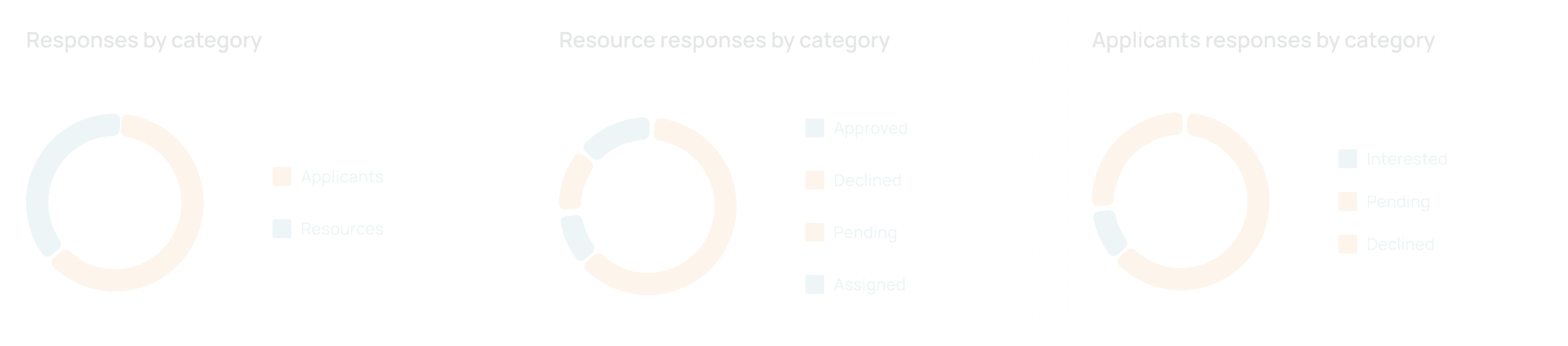
Redesigned the campaign dashboard from decorative donut charts with no numbers into a funnel and headline stats a recruiter can read in under a second.
•
Wrote the compliance and failure-state spec covering STOP handling, draft persistence, and every toast message shipped to engineering.
Where It Started
Outreach already existed before this redesign — buried under Resources, as one dense table with Yes/No/Cancel/Stop counters, no numbers that meant anything, and no way to actually create a campaign.

WHAT SURVIVED VS. WHAT DIDN’T
The auto-reply templates and 24/48/72-hour reminder cadence encoded years of real operational knowledge worth keeping. What was missing was everything around them: a creation flow, a funnel, and any sense of whether a campaign was actually working.
Why SMS, Why a Review Gate
The channel and safety decisions weren’t taste — they’re backed by evidence from recruiting-text benchmarks and interaction-design research.
•
Recruiting texts see a 37% response rate versus roughly 2% for email, with a 12-minute average reply time (iCIMS / TextRecruit).
•
Carriers require standardized STOP opt-out handling — the basis for baking YES / NO / STOP into every template (CTIA Messaging Principles).
•
People judge position and length far more accurately than angle or area — the reason the campaign funnel is drawn as bars, not donuts (Cleveland & McGill, 1984).
•
A mass SMS send is irreversible: Nielsen Norman Group’s guidance on confirmation dialogs shaped the review-before-launch step.
Four Principles Behind Every Screen
P·01
Numbers before shapes
A recruiter’s question is “how many?”, not “what proportion?”. The number should always be more prominent than the chart decorating it.
P·02
One decision per screen
Channel, audience, message, launch. Each is a different cognitive task — the wizard keeps them apart instead of combining them into a wall.
P·03
Fast by default, careful once
Imports, saved filters and AI drafts remove work everywhere, so the flow can afford one deliberate review gate before the irreversible send.
P·04
The unhappy path is the product
Toasts, fallbacks, expiring drafts, a candidate replying “maybe?” — bulk messaging earns trust in its failure states.
Goals
Defined with the product team before any screen was drawn:
•
Complete the flow in under five minutes — recruiters run 20+ outreaches a day.
•
Hit 80%+ response rates, the primary KPI on the campaign dashboard.
•
Favor filters over scrolling when selecting candidates from a pool of hundreds.
•
Preview the exact message before an irreversible send.
•
Support scheduling for large batches, not just immediate sends.
Finding the Shape in Greyscale
Early passes stayed colourless on purpose: grey wireframes let the team debate structure — what is a campaign, where creation lives, what “done” means — without anyone reacting to a button colour first.


Filters earned their own exploration. Watching recruiters narrow 260 candidates made one thing clear: the same searches repeat every week. “Forklift-certified, within 25 miles, bilingual, available now” isn’t a query — it’s a saved asset, one click away.
exploration · saved filters

The 4-Step Wizard
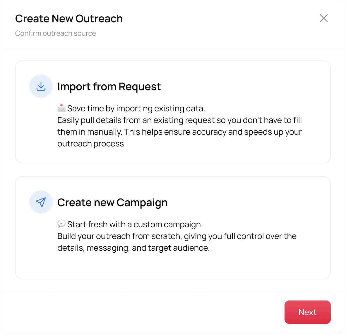
Channel, candidates, message, review — each step answers exactly one question, so a coordinator running dozens of these a day can leave and resume without losing the thread.
Two entry points reach the same wizard: a fresh campaign from Recruiting, or ‘Outreach’ on an existing request row, where job details import themselves.
01
Confirm the source
Import an existing customer request, or start a fresh campaign. One clear decision before anything else.
02
Select candidates
Search a pool of hundreds by list, card or map view, with saved filters for searches recruiters repeat every week.

step 2 · map view · ai filters

The third way to choose people: a map. On-site shift work makes distance disqualifying, so candidates appear as pins inside a radius, each with a profile card one tap away.
03
Draft the message
An AI-generated template arrives pre-filled with job details, merge fields, and YES / NO / STOP compliance language — always editable.

step 3 · generating

Generation is shown honestly — skeleton lines and a progress readout, not a frozen screen. The draft always lands editable.
04
Review, then launch
A summary of exactly what’s about to happen sits beside a live message preview, before the one irreversible action in the whole flow.

launch confirmed

Success states the outcome in plain language — “messages are being sent to all selected 111 candidates” — never a bare checkmark.
Numbers Before Shapes
The campaign dashboard redesign: donut charts with no numbers became stacked bars with counts and percentages, and four identical placeholder bars became a real funnel with visible drop-off at every stage.
Before

After

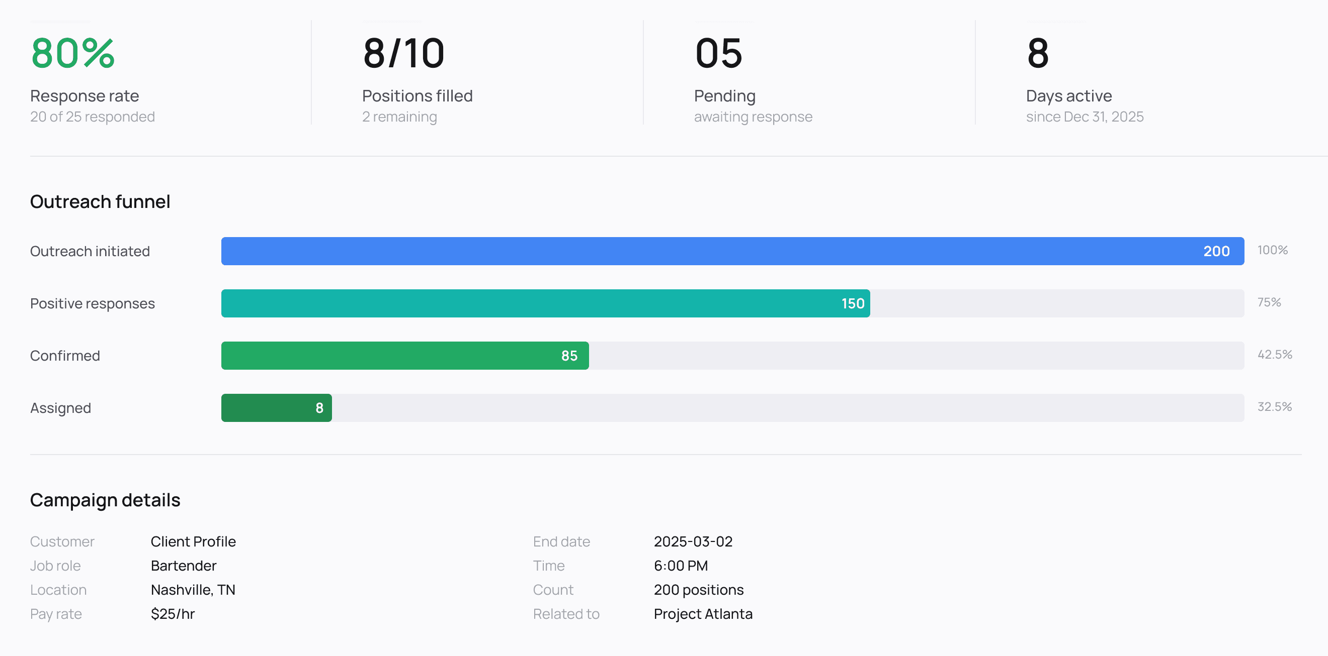
The chart-type choice isn’t a style preference: people judge position and length more accurately than angle or area (Cleveland & McGill, 1984), which is why the funnel is bars, not donuts.
The redesigned campaign detail page: headline response rate, funnel, and a candidate response table with a direct Assign action — closing the loop the legacy table never had.

Designing the Parts Nobody Screenshots
A large share of this project’s time went into the system’s voice when things go sideways. Every state below shipped to engineering as written spec, not a TODO.
Campaign launch
Success
“Outreach created and messages sent to selected candidates.”
Campaign launch
Failure
“Unable to create outreach. Please check required fields.”
Candidate selection
Blocked
“Please select at least one candidate to continue.”
Reminder blast
Success
“Follow-up message sent to all pending candidates.”
AI generation
Success
“A personalized message template has been generated.”
FALLBACK SMS — VERBATIM SPEC
“We couldn’t understand your response. Please reply YES to accept, NO to decline, or STOP to opt out.”
Drafts that survive a device switch
If a recruiter finishes selecting candidates and walks away, that work persists server-side — we debated localStorage and rejected it, because coordinators genuinely move between desktop and mobile mid-task. On return, the dashboard offers “Continue draft outreach” with a timestamp and recipient count. Drafts expire after seven days, with a nudge at day five.
Invisible plumbing with visible consequences
•
Attachments travel as short links — SMS has no room for media, so uploads become shortened, trackable, phone-browser-safe URLs.
•
Media self-destructs at six months — auto-deletion with logged events; retention policy expressed as product behaviour.
•
Archive means read-only — archived campaigns keep their history but refuse edits at the API level, not just in the UI.
What This Project Actually Taught Me
01
Audit the ugly product generously
The legacy page looked like a mess and read like a manual. Its templates and reminder cadences were years of operational learning in disguise.
02
Charts are answers, not decoration
If the question is “how many?”, the answer is a number — render it like one. Every chart now has to justify the space it takes from the figure it explains.
03
Trust is built in the failure states
The fallback SMS, the seven-day draft, the specific confirmation copy — that’s where a recruiter decides whether the tool has their back.
04
Speed and safety aren’t opposites, they’re sequenced
Make everything fast, then place one deliberate gate exactly where the cost of error is highest.
Where it landed: the full flow — both entry points, all four steps, the dashboard, and every failure state above — shipped to engineering as dev-ready spec. Because the product is pre-launch, there are no outcome numbers to claim yet; what’s instrumented instead is the scoreboard defined up front: time-to-send, response rate, saved-filter usage, AI-template adoption, and schedule-vs-immediate ratio. The design will be judged by the same dashboard it ships with.
Reading This Alongside the Platform
Outreach is one module inside the broader Workforce Management Platform documented above — scoped here because it’s the clearest example of turning an operationally-sound but illegible legacy screen into a flow recruiters can actually trust at scale. Toast copy, compliance fallbacks, and draft-persistence rules shipped to engineering as written spec, but the flow itself is still evolving alongside the rest of the platform.
Thank you for viewing this case study
This represents my approach to complex product design challenges: thorough research,
collaborative problem-solving, and data-informed iteration leading to measurable
business impact.